- Community Hub
- Forum Q&A
- Business iQ (Analytics)
- Controller (SaaS, On Premise)
- Dashboards
- Dynamic Languages (Node.JS, Python, PHP, C/C++, Webserver Agent)
- End User Monitoring (EUM)
- Infrastructure (Server, Network, Database)
- Java (Java Agent, Installation, JVM, and Controller Installation)
- Licensing (including Trial)
- .NET (Agent, Installation)
- Smart Agent
- General Discussions
- Resources
- Groups
- Idea Exchange
Not a customer? Click the 'Start a free trial' link to begin a 30-day SaaS trial of our product and to join our community.
Existing Cisco AppDynamics customers should click the 'Sign In' button to authenticate to access the community
- Cisco AppDynamics Community
- Resources
- Share a tip
- When adding a Time Series Graph widget, include ba...
- Subscribe to RSS Feed
- Mark Topic as New
- Mark Topic as Read
- Float this Topic for Current User
- Bookmark
- Subscribe
- Mute
- Printer Friendly Page
When adding a Time Series Graph widget, include baseline data
- Mark as New
- Bookmark
- Subscribe
- Mute
- Subscribe to RSS Feed
- Permalink
- Report Inappropriate Content
02-17-2021 01:32 PM - last edited on 04-02-2024 05:46 PM by Ryan.Paredez
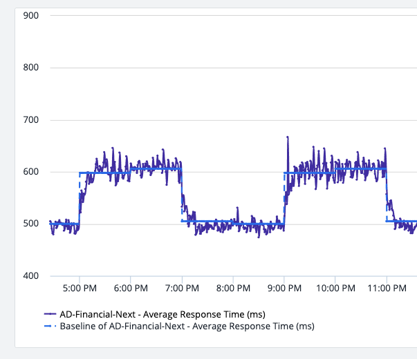
Often we rely on dashboards to tell a story. One of the popular dashboard widgets is the Time Series Graph, which allows us to observe how the value of a metric changes over time. Sometimes it's hard to know if what we're seeing in the graph is 'normal'. Luckily, we can overlay the baseline value on the plot, which allows us to easily compare current values to what AppDynamics expects. Simply check the 'Include Baseline Data' box in the Advanced section when adding a metric to a Time Series Graph:
When your graph is displayed you'll notice a dashed line corresponding to the expected metric values for the time period:

Thank you! Your submission has been received!
Thank you! Your submission has been received!
Oops! Something went wrong while submitting the form

