- Community Hub
- Forum Q&A
- Business iQ (Analytics)
- Controller (SaaS, On Premise)
- Dashboards
- Dynamic Languages (Node.JS, Python, PHP, C/C++, Webserver Agent)
- End User Monitoring (EUM)
- Infrastructure (Server, Network, Database)
- Java (Java Agent, Installation, JVM, and Controller Installation)
- Licensing (including Trial)
- .NET (Agent, Installation)
- Smart Agent
- General Discussions
- Resources
- Groups
- Idea Exchange
Not a customer? Click the 'Start a free trial' link to begin a 30-day SaaS trial of our product and to join our community.
Existing Cisco AppDynamics customers should click the 'Sign In' button to authenticate to access the community
- Cisco AppDynamics Community
- Resources
- Knowledge Base
- How do I view license usage on the Subscription pa...
- Subscribe to RSS Feed
- Mark as New
- Mark as Read
- Bookmark
- Subscribe
- Printer Friendly Page
- Report Inappropriate Content
At 6pm PST, the AppDynamics Community will go into read-only mode and after migration is complete, you will be redirected to community.splunk.com.
Read more here
- Article History
- Subscribe to RSS Feed
- Mark as New
- Mark as Read
- Bookmark
- Subscribe
- Printer Friendly Page
- Report Inappropriate Content
on
06-29-2018
09:45 AM
- edited on
07-13-2022
02:57 PM
by
Claudia.Landiva
Better to understand your SaaS Controller’s license consumption and limits with license usage graphs
Note: License usage graphs are not available for on-prem Controllers.
In this article...
- How do I get to the Subscriptions page?
- How do I see recent or current usage for all products?
- How do I see historical usage for individual products?
- How do I use cumulative and non-cumulative usage graphs?
- Additional Resources
How do I get to the Subscriptions page?
- To get started, sign in to your www.appdynamics.com account.
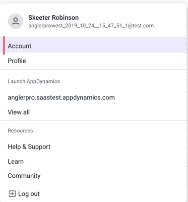
- Click on your name in the top right and click Account. The Account Overview page will open.
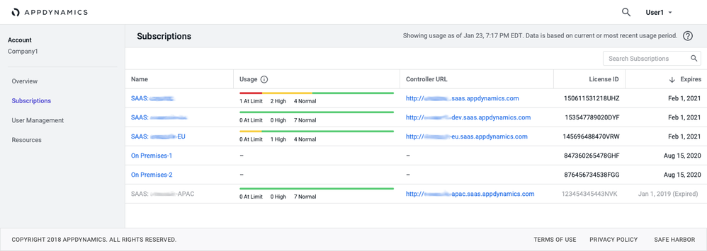
- On the left navigation panel of the Account Overview page, click the Subscriptions link. The Subscriptions page will open.
- If you have more than one license, click the one you’d like to view.
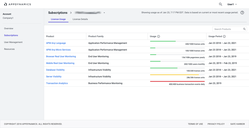
- Once you choose a license, you can view all its products' usage.
- There are two possible views to choose from once you are on the License Usage tab:
- Current usage for all of your products
- Historical usage for an individual product
How do I see recent or current usage for all products?
The License Usage tab displays data for all your products from the current or most recent usage period. It shows the data captured and aggregated from the previous day. For detailed instructions, see License Usage documentation.
Please note that it is measured differently for each product, as described in the License Entitlements and Restrictions documentation.
How do I see historical usage for individual products?
To view historical usage for a particular product, click the product name link on the License Usage tab.
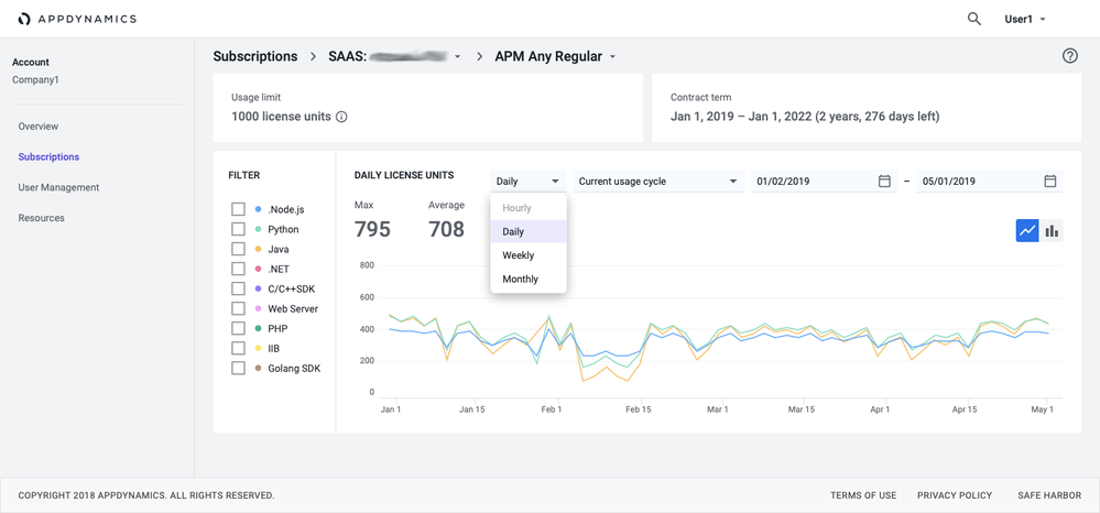
You will be able to see the product's license information, maximum and average usage metrics, and total (cumulative) license usage.
Refer to the License Usage documentation for additional detail.
Product License Information
You can choose between viewing a line chart or bar chart. The default time frame is 3 months, but you can adjust it in the top-right corner. You can also select from different levels of data granularity: daily, hourly, weekly, or monthly. We’ve provided the granularity levels that best correspond with different time ranges.
Data is captured in 5-minute intervals and then aggregated into larger intervals. You may notice that if you choose a longer time frame, then certain options are disabled. For example, if you choose a time frame longer than one month, then hourly granularity is disabled.
Max and Average Usage Metrics
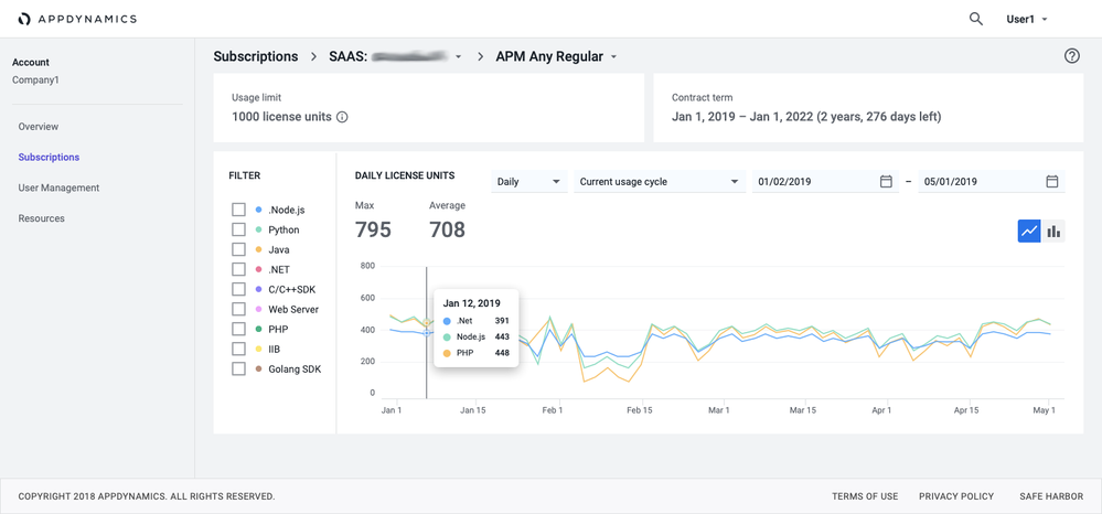
For certain products, like those under the Application Performance Management and Infrastructure Visibility families, the x-axis is the time frame, and the y-axis is the number of license units used. You can see two types of metrics in the header:
- Max - The maximum usage of all agents aggregated over the time frame you chose in the date selector. In other words, it’s the maximum of all the data points on the graph.
- Average - The average of all agents reporting usage during the time frame chosen in your date selector. In other words, it’s the average of all the average values on the graph.
NOTE | The APM Any product includes multiple agents. To drill down into usage for a particular agent (e.g., Java), click its corresponding checkbox in the filter bar. Agents that don’t report data during the selected time-frame are grayed out in the filter.
How do I interpret metric types?
- When viewing all agent types, you see the maximums of all agents as well as the average of all agents reporting usage over the selected time frame.
- When viewing only one agent type, the results are restricted to that single agent’s data.
- When viewing a subset of agent types (not all), their maximums and averages are calculated based only on the agents chosen.
Hover over a data point on the graph to see granular metrics. If you choose a time frame of less than 1 month, you’ll see hourly metrics. If you select a time frame greater than or equal to 1 month, you’ll see daily data.
How do I use cumulative and non-cumulative usage graphs?
For certain products under End User Monitoring and Application Performance Management, there are two graph types. One graph presents a cumulative plot for a given usage cycle. The other graph presents a non-cumulative plot for the same usage cycle.
In both graph types, you can specify the granularity of data you want to view (in addition to the time frame). Please note that the data is measured differently for each product, as described in the License Entitlements and Restrictions documentation.
How do I switch between metered and license unit views?
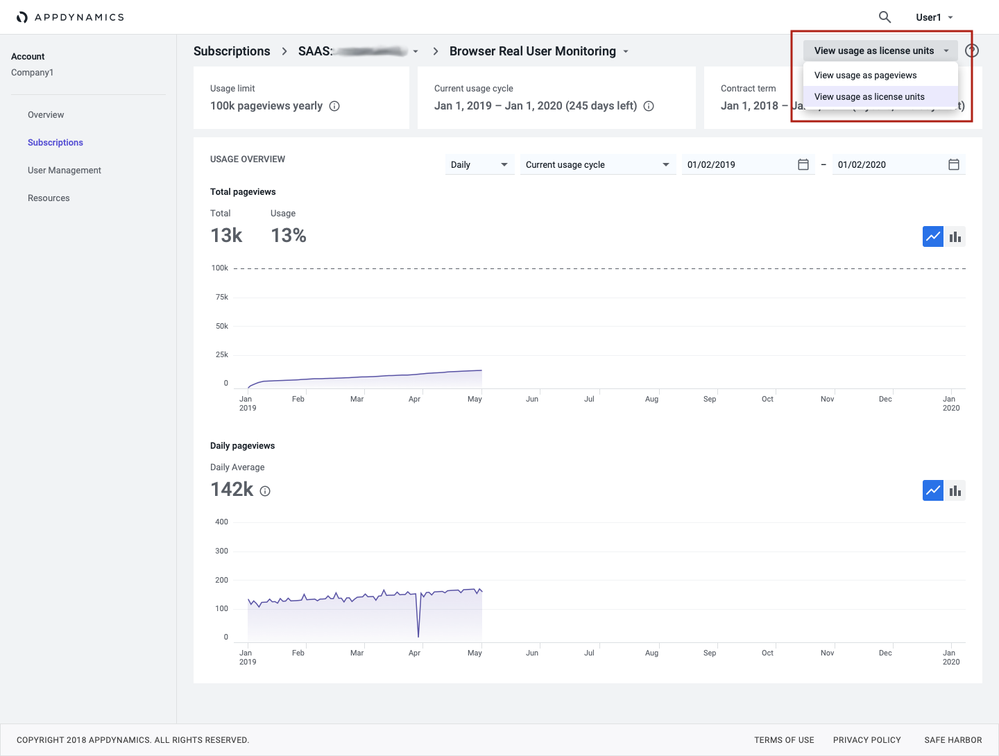
Click the top right to switch views between metered view and license units. The usage data presented is the same in both graphs. The y-axis reflects either the metered or license view.
For example, with Browser Real User Monitoring, usage can be viewed as pageviews or as license units. The same usage shows on both graphs’ x-axes, while either the pageviews or license units show on the respective y-axis.
License units are always rounded up to the next highest integer because that is the minimum amount you would need for your monitoring.
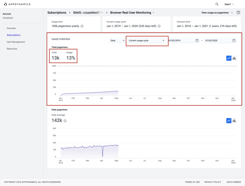
The cumulative plot graph
For example, the y-axis for Mobile Real User Monitoring represents Monthly Active Agents. This graph displays the total number of monitored events—during either a usage cycle or a time frame you choose.
For a given usage period, the Usage Overview will show usage as a percentage so you can see what quantity has been consumed against your total allocation.
Hover over a data point on the graph to see granular metrics. If you choose a time frame of less than 1 month, you’ll see hourly metrics. If you select a time frame greater than or equal to 1 month, you’ll see daily metrics.
The non-cumulative plot graph
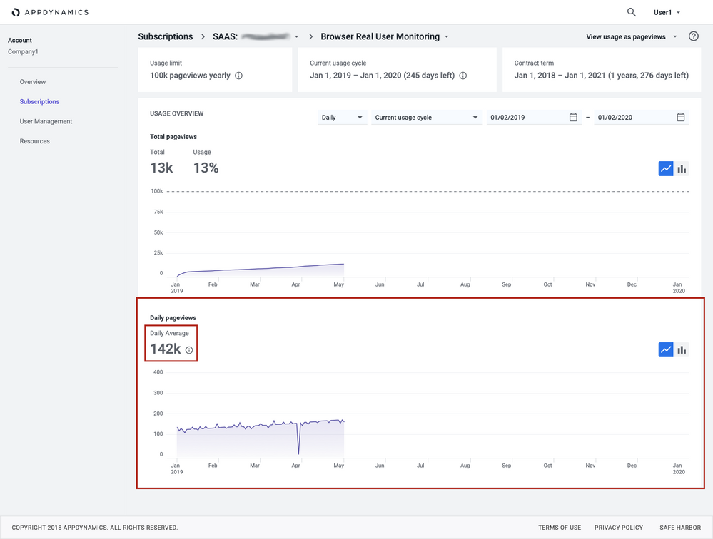
This graph plots the usage for a product’s given usage cycle or time-frame. You select the granularity in the dropdown. The non-cumulative graph helps you determine:
- how much of the product is being used at a regular cadence
- whether there are spikes in usage
Hover over a data point on the graph to see granular metrics. You can also view an average data point for the granularity chosen.
Additional Resources
Join us on Feb 26 to explore Splunk AppDynamics deployment strategies, SaaS models, agent rollout plans, and expert best practices.
Register Now
Dive into our Community Blog for the Latest Insights and Updates!
Read the blog here

Thank you! Your submission has been received!
Thank you! Your submission has been received!
Oops! Something went wrong while submitting the form
