- Community Hub
- Forum Q&A
- Business iQ (Analytics)
- Controller (SaaS, On Premise)
- Dashboards
- Dynamic Languages (Node.JS, Python, PHP, C/C++, Webserver Agent)
- End User Monitoring (EUM)
- Infrastructure (Server, Network, Database)
- Java (Java Agent, Installation, JVM, and Controller Installation)
- Licensing (including Trial)
- .NET (Agent, Installation)
- Smart Agent
- General Discussions
- Resources
- Groups
- Idea Exchange
Not a customer? Click the 'Start a free trial' link to begin a 30-day SaaS trial of our product and to join our community.
Existing Cisco AppDynamics customers should click the 'Sign In' button to authenticate to access the community
- Cisco AppDynamics Community
- Resources
- Knowledge Base
- Custom Dashboard Dos and Don'ts
- Subscribe to RSS Feed
- Mark as New
- Mark as Read
- Bookmark
- Subscribe
- Printer Friendly Page
- Report Inappropriate Content
At 6pm PST, the AppDynamics Community will go into read-only mode and after migration is complete, you will be redirected to community.splunk.com.
Read more here
- Article History
- Subscribe to RSS Feed
- Mark as New
- Mark as Read
- Bookmark
- Subscribe
- Printer Friendly Page
- Report Inappropriate Content
on
08-07-2020
02:47 PM
- edited on
11-17-2020
06:20 PM
by
Claudia.Landiva
What do I need to consider when designing a custom dashboard?
A custom dashboard lets the user display a specific set of metrics and data points on a single screen. Custom dashboards can show application, server, and database metrics reported by AppDynamics Agents.
By presenting metrics of interest to a specific audience, custom dashboards offer a supplement to AppDynamics' built-in dashboards.
FAQ
- How can I create a sample custom dashboard?
- What are some best practices when designing custom dashboards?
- What are some things to avoid?
- What kinds of custom dashboards can a user create?
- Can a read-only user edit a custom dashboard?
- Can a user change a dashboard's name and metric series' color?
- How can I learn more?
How can I create a sample custom dashboard?
Use the JSON file in each of the following links to create a custom dashboard.
- Dev teams
- Ops teams
- Ops management
- QA teams
- Browser real-user monitoring
- Application key metrics
- Business transaction reports
- Identify the list of key metrics that the dashboard should display.
- For each metric, determine the appropriate widget to render the metric data.
- Sometimes a chart representation works best. Other times a metric value will be sufficient. Some data is best displayed in a pie chart.
- Sometimes a chart representation works best. Other times a metric value will be sufficient. Some data is best displayed in a pie chart.
- Design health rules that represent the health of business transaction, service or subcomponent.
- Consider the appropriate health rule thresholds carefully to avoid false alerts, especially for critical violations.
- Note that unlike alerts, status lights do not indicate which condition or which node, tier or business transaction violated the health rule.
- Health rules that will be used for status lights, therefore, need to be specific to a given node, tier or business transaction.
- Design the dashboard layout.
- Consider how to fit all the metrics on the dashboard, and which layout best presents the data.
- Pick a color scheme, not just for visual appeal, but also to make the data stand out.
- Once built, plan for a tuning period.
- For example, the time range might need to be adjusted, or health rule thresholds changed, to avoid false alerts.
- For example, the time range might need to be adjusted, or health rule thresholds changed, to avoid false alerts.
- After encountering a production issue, evaluate each dashboard, and identify what additional metrics should be captured, and what changes should be made, in case the same or a similar issue happens again. If needed, design additional dashboards.
- Do create dashboards that watch metrics associated with previous production issues.
What are some things to avoid?
Additionally:
- Don't make dashboards larger than your screen resolution. A custom dashboard that requires scrolling is not ideal.
- Don't set the refresh timing to 60 seconds as 5 minutes is usually sufficient.
What kinds of custom dashboards can a user create?
- Executive Dashboards - The executive dashboards should include a number of status lights for each key user or system journey step health and performance, as well as any KPI or SLA metrics. These dashboards also show any business metrics or impact information.
- Operations Dashboards - The operations dashboards should include a number of status lights for each service (tier and/or Top BT), to provide a global overview of the health of the application infrastructure. These dashboards can also contain an Events List.
- Application Dashboard - These dashboards target an application and show the health of key business transactions, highlighting call volumes, response times, and error rates (for a given application or tier). It also uses status lights to indicate the health of each top business transaction.
- Service Dashboards - These dashboards each target an individual service and show key health metrics for the service (tier), including the call volume, response time and error rate for the service overall as well as for important API calls. The service dashboard can also show CPU and memory consumption as well as garbage collection statistics for each node in the tier. A corresponding status light that provides a visual health indicator can accompany each metric.
Can a read-only user edit a custom dashboard?
Yes, if the read-only user is given permission to edit a custom dashboard on the Administration page.- As an Admin, click the gear icon in the Controller UI.
- Select Administration from the drop-down menu.
- Click on the Roles tab.
- Select the read-only user's name from the list of usernames on the left.
- Click on the Custom Dashboards tab.
- Use the checkboxes to allow the read-only user to view, edit, or delete custom dashboards.
- Click the Save button.
Can a user change a dashboard's name and metric series' color?
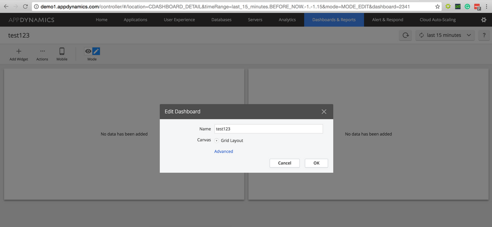
- Click on the Dashboards & Reports tab in the Controller UI.
- Click on the pencil icon.
- Select Edit Dashboard Properties from the drop-down menu.
Edit dashboard name:
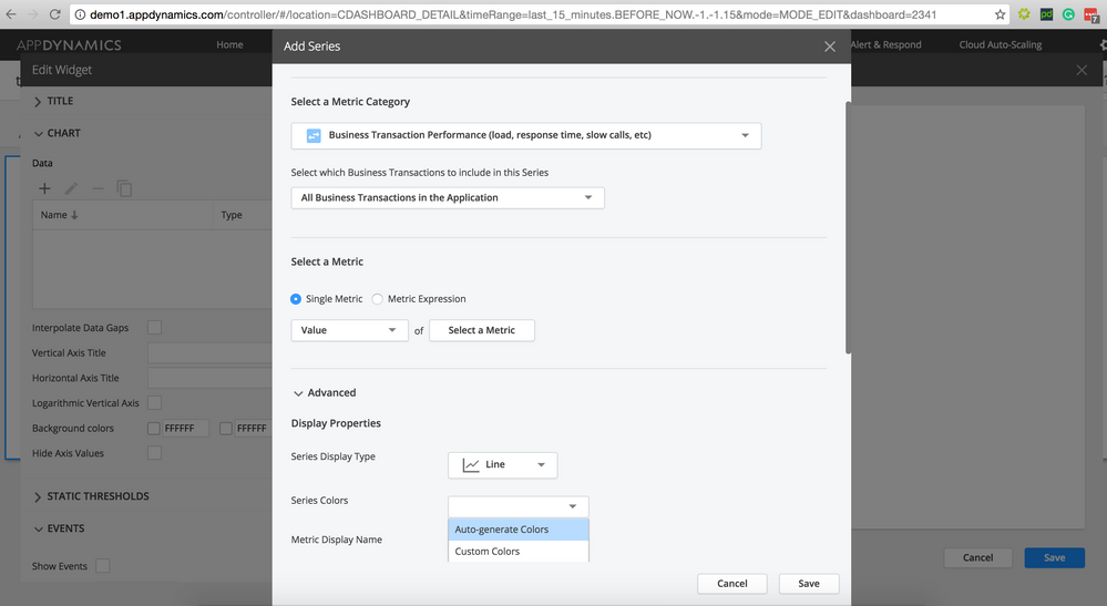
Edit metric series colors:
If you have an active AppDynamics account, visit AppDynamics University and enroll in the "Custom Dashboards and Dashboard Templates" self-paced course to learn how to build your own custom dashboards. Standard self-paced courses are available to Standard University subscribers, and are available at no cost to AppDynamics customers.
AppDynamics also offers the "APM223 - Proactive Monitoring and Dashboards" instructor-led course for more insight on creating dashboards, reports, and widgets. Instructor-led courses are available to Premium University subscribers; contact your Account Manager for pricing.
Visit the AppD University Group Hub for University FAQs and how-to articles.
Additional Resources
- Blog: 7 steps to great APM dashboards by Justin Vaughan-Brown
-
Blog: AppD on AppD: Scaling Our Custom Dashboards Platform by Mandar Khoje
-
Accessing your performance data with the AppDynamics REST API by Dustin Whittle
- Join the conversation on the Dashboards discussion board
- Mark as Read
- Mark as New
- Bookmark
- Permalink
- Report Inappropriate Content
Hi,
Is it possible to use the timeseries graph to show multiple Custom Metrics using wildcards? We have created a simple extension that greps the status of multiple SAS servers and sends those to Custom Metrics under some Tier in a path like "Custom Metrics|SAS Servers|<servername>|Status". When I'm trying to show the status of all instances using the timeseries graph by replacing the <servername> with asterisk the graph comes up empty. I can get all statuses through the REST API and even create a health rule targeting the Tier (or Nodes) and giving the wildcard path and it works. Why isn't it working in Dashboards?
- Mark as Read
- Mark as New
- Bookmark
- Permalink
- Report Inappropriate Content
Hi,
Currently custom metric dosen't support wild card and we already have a request with us regarding wild card support to custom metric. But the requirement can be achieved by selecting "Tire/Node health- Hardware ..." and provide the relative path for custom metrics with wild card.
- Mark as Read
- Mark as New
- Bookmark
- Permalink
- Report Inappropriate Content
Hi,
Your suggested way seems to work in Health Rules but not with Dashboards as I already tried to explain in my previous message. Or do you have an example where this way works with Dashboards as well?
Our controller is v4.3.1.2.
- Mark as Read
- Mark as New
- Bookmark
- Permalink
- Report Inappropriate Content
Hi,
We have an ongoing request regarding wild card support for custom metric. Though for few of our customers the above workaround is working.
- Mark as Read
- Mark as New
- Bookmark
- Permalink
- Report Inappropriate Content
How can I bookmark a dashboard so that when I am automatically logged out I can immediately return to the same dashboard?
Join us on Feb 26 to explore Splunk AppDynamics deployment strategies, SaaS models, agent rollout plans, and expert best practices.
Register Now
Dive into our Community Blog for the Latest Insights and Updates!
Read the blog here

Thank you! Your submission has been received!
Thank you! Your submission has been received!
Oops! Something went wrong while submitting the form


